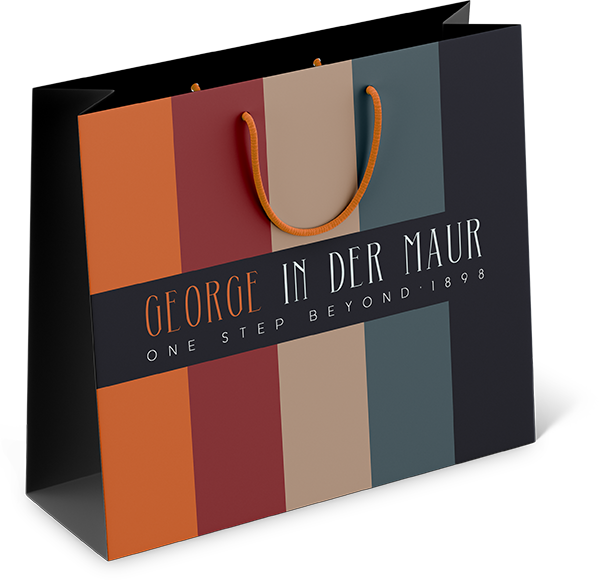


George In der Maur
George In der Maur is a four generation old family company specialized in orthopedic shoes. They needed a rebranding that did justice to their legacy - having more than 120 years of experience and going further than any other company providing solutions where others fail.
Their brand personality - or lack of personality - was merely functional, in a medical, clinical way. The company colors were Ruby Red and Burberry Beige, oozing both quality and craftsmanship, and a functional Conservative Blue. We added the colors Hermès Orange, Slate Grey and Majestic Black - and killed the Blue - to give it a more stylish, contemporary look. The font of the logo with the name George highlighted in the Hermès Orange is both classic and modern. The pay off ‘one step beyond’ communicates that it goes further than any other company as well as literally bringing their clients further. Expanding their livelihood. It’s also inspirational.


Privium
Privium is an airport loyalty scheme for frequent travellers at Amsterdam Schiphol Airport, offering priority passport control, front parking and access to the ClubLounge. This range of privileges caused a scoop in the airport world. It received several awards, among which Cool Brand and Superbrand.
Privium positions itself as premium, high-class, individualistic, ahead of the rest, and appeals to the need to be respected and to feel on-top-of-the-world. Privium wants to be perceived as exclusive and only available for the lucky few.
The creation of the Privium brand & experience was based on psychological insights in passengers’ needs. Frequent travellers are used to being in control, often focused on status. Privium members are part of a select group. Privium offers visible distinction - privileges for Privium members only - and recognition. Therefore, the pay off “A select way to travel” was introduced. As well as a logo in line with the brand values.
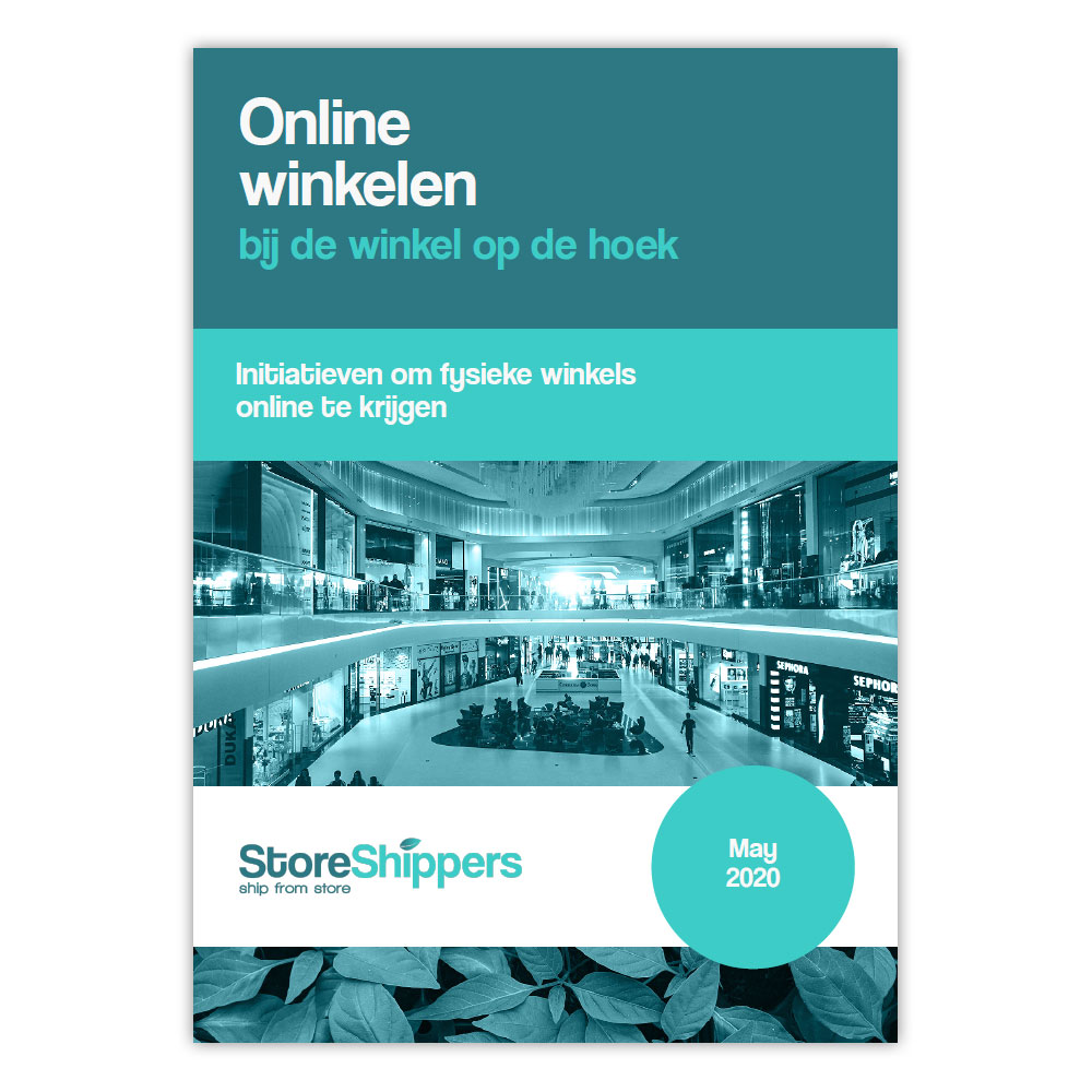
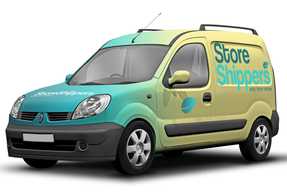
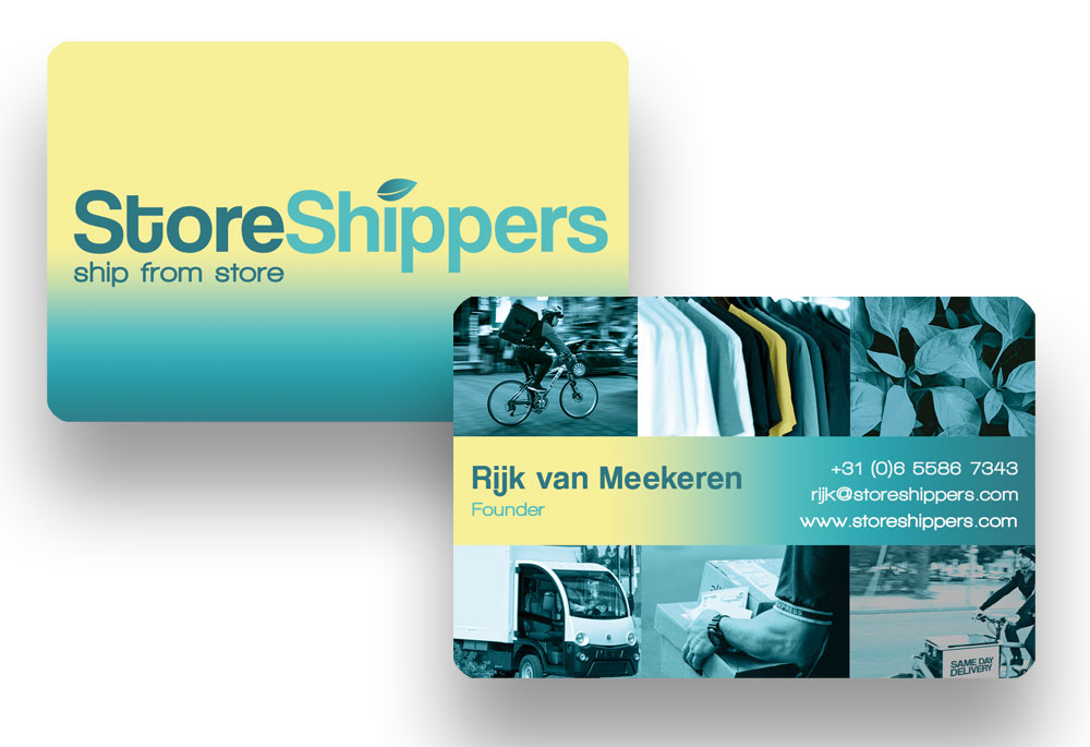
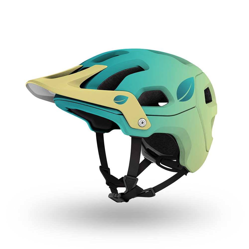
STORE SHIPPERS
StoreShippers is a logistics company specialized in sustainable same-day delivery. They ship straight from stores, worldwide. They position themselves as questioning and simplifying illogics, to make the world a better connected and eco-friendly place.
There is always a simpler way
Simplicity is the trademark of genius – Robin Sharma
We designed a logo that is friendly, smooth and round. The soft Congeniality yellow oozes sympathy and optimism. The Sea green and Ocean turquoise emit sustainability - emphasized by the presence of the leaf. Logistics is a business of trust - which needs to be grounded - so we opted for Sea green combined with the Seashell white to give it a clear and transparent feel. And we applied icons and animation to emphasize the simplistic approach.


B2C EUROPE
B2C Europe is a cross-border ecommerce logistic company. It has the ambition to be the Experts & Innovators in cross-border eLogistics in Europe. In order to succeed, B2C Europe needs to become a strong brand to differentiate itself and stand out, capture new market attention, have higher levels of loyalty, and a clear internal and external focus.
They had no sense of their brand essence and DNA - it was however an ambitious company. What makes them different is their challenging nature, always questioning the status quo, being convinced there was always a better - more clever - way. This is their spark, their essence. We built from there.
Using the psychological characteristics model of Adler, their brand personality is in the quadrant of discovery, challenge and exploration. Always pushing boundaries. Always wondering if there is a better way and come up with clever solutions.
BLINK FACILITY
Blink is a cleaning company. With a highly sophisticated - Diva - founder. Cleaning high end offices only. She goes for clean beyond the surface - spotlessly clean - in a fabulous way. We created a pay-off that communicates the essence of Blink: A clean office is all about respect. Respect for your clients, respect for your employees.
Good care goes well beyond the surface. Blink stands out from the cleaning crowd by providing a spick-and-span, well looked after shiny result, honoring your office.
We designed a logo that was both clean and stylish - making use of a strong sophisticated color fuchsia combined with black and white. The website also has a clean, minimalistic look, working with the elegant and clean colors black, white, gray combined with the strong contrast color - fuchsia - to give it an outstanding Diva look. And give it energy.